Case study at
Optimizing Sales Flow on the Haravan POS App
How I upgraded from the outdated design to align with current market standards and help sellers achieve efficiency in selling
👩🏻💻
My role
Product Design
📱
Platform
Mobile-app
⏱️
Timeline
October 2023
💬
Context
Haravan is a company operating in the e-commerce sector in Vietnam, providing merchants with omni-channel sales solutions as well as business operation systems.
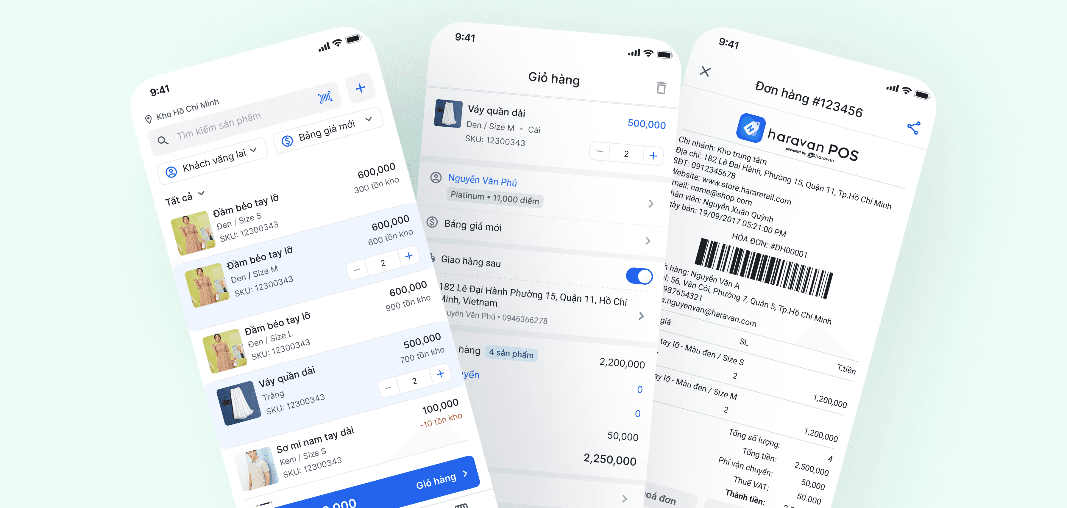
It owns Haravan POS, a sales application designed to support retailers in shops. It covers functions such as selling activity, shift records, inventory control, and daily report,...
Due to some poor user experiences, the app has not fully optimized selling efficiency. Sellers feel that the process is slow, even though selling is one of the core activities of the app.
Currently, Haravan POS is available on both desktop and mobile versions, allowing sellers to use flexibly based on their selling context.
Desktop & Mobile versions
However, merchants have expressed dissatisfaction with the mobile app experience.
We received feedbacks of this topic through featureOS (merchants used it to communicate with us)
Merchants were dissatisfied with the app
We gathered merchants’ feedbacks and they said that

I want to reflect on the selling process
The selling process
In the context of selling in retail stores, there are three main phases:
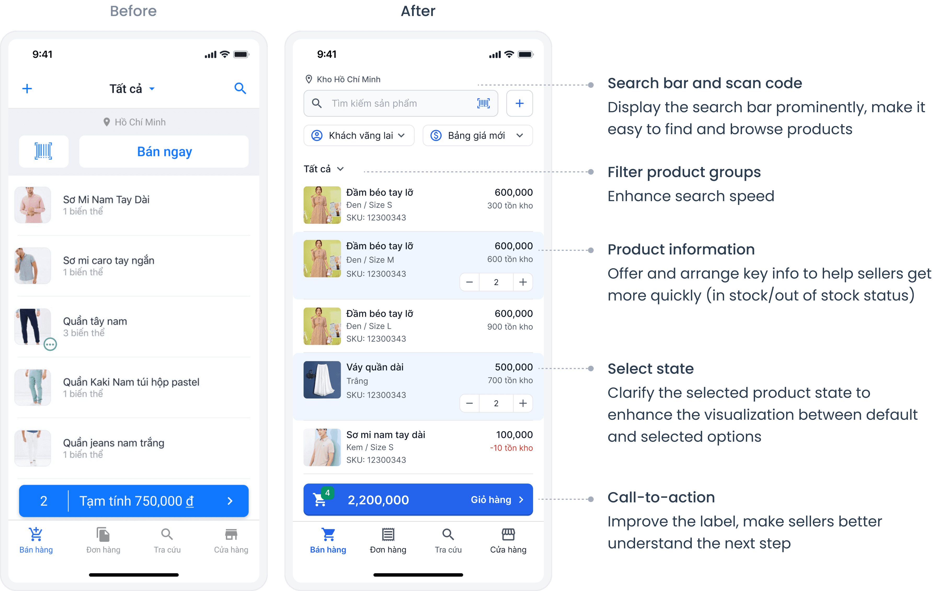
Product Consultation
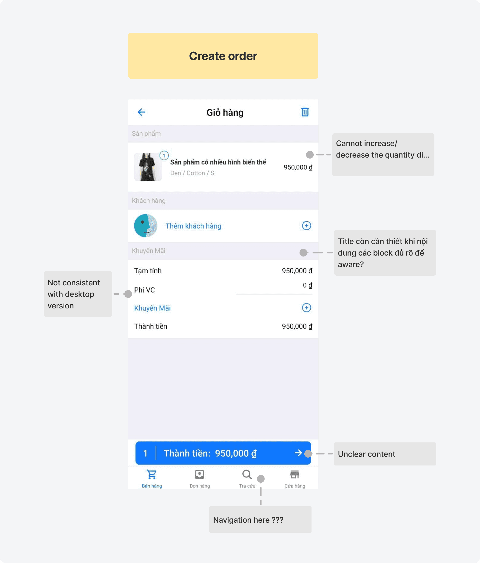
Order Creation
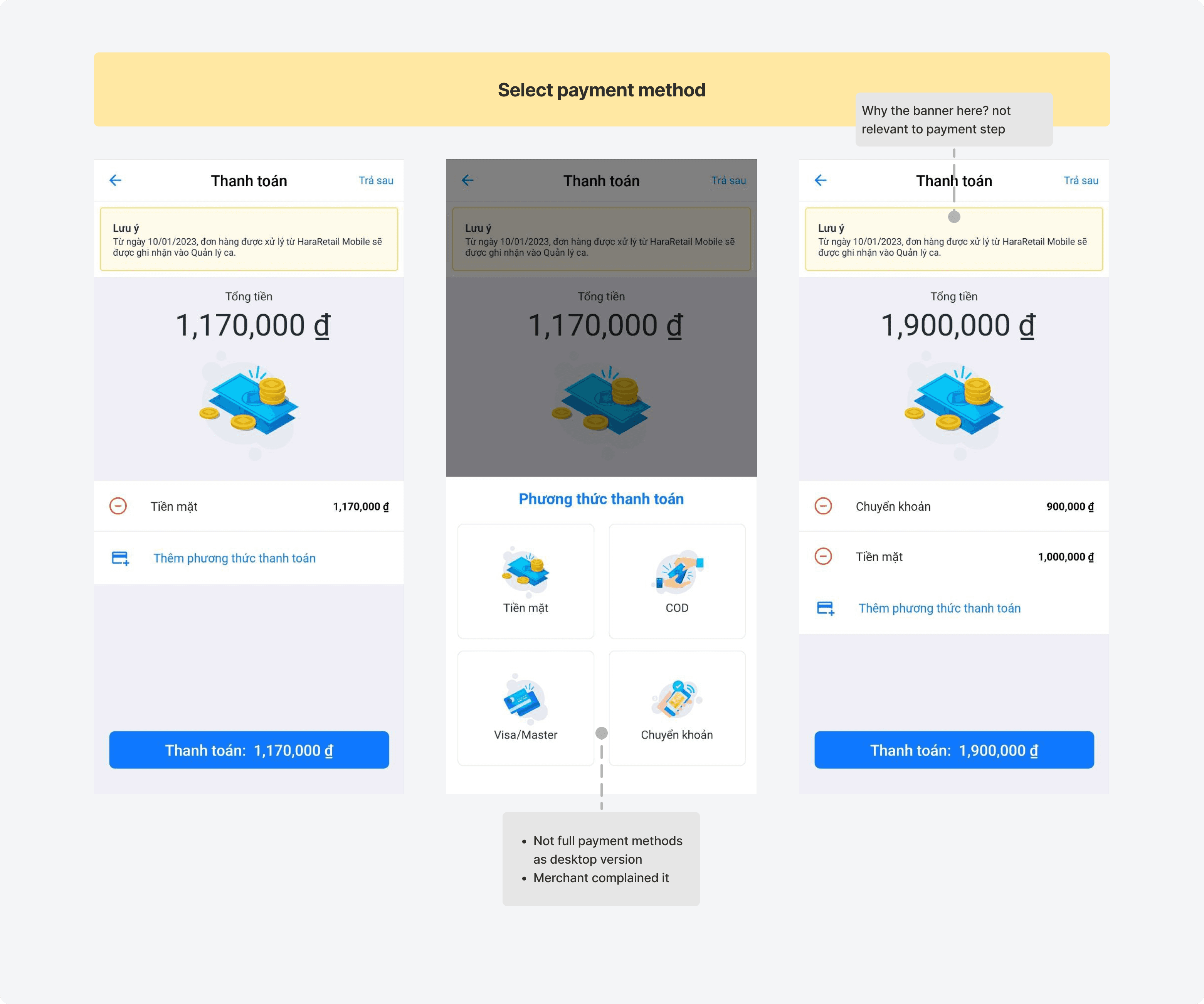
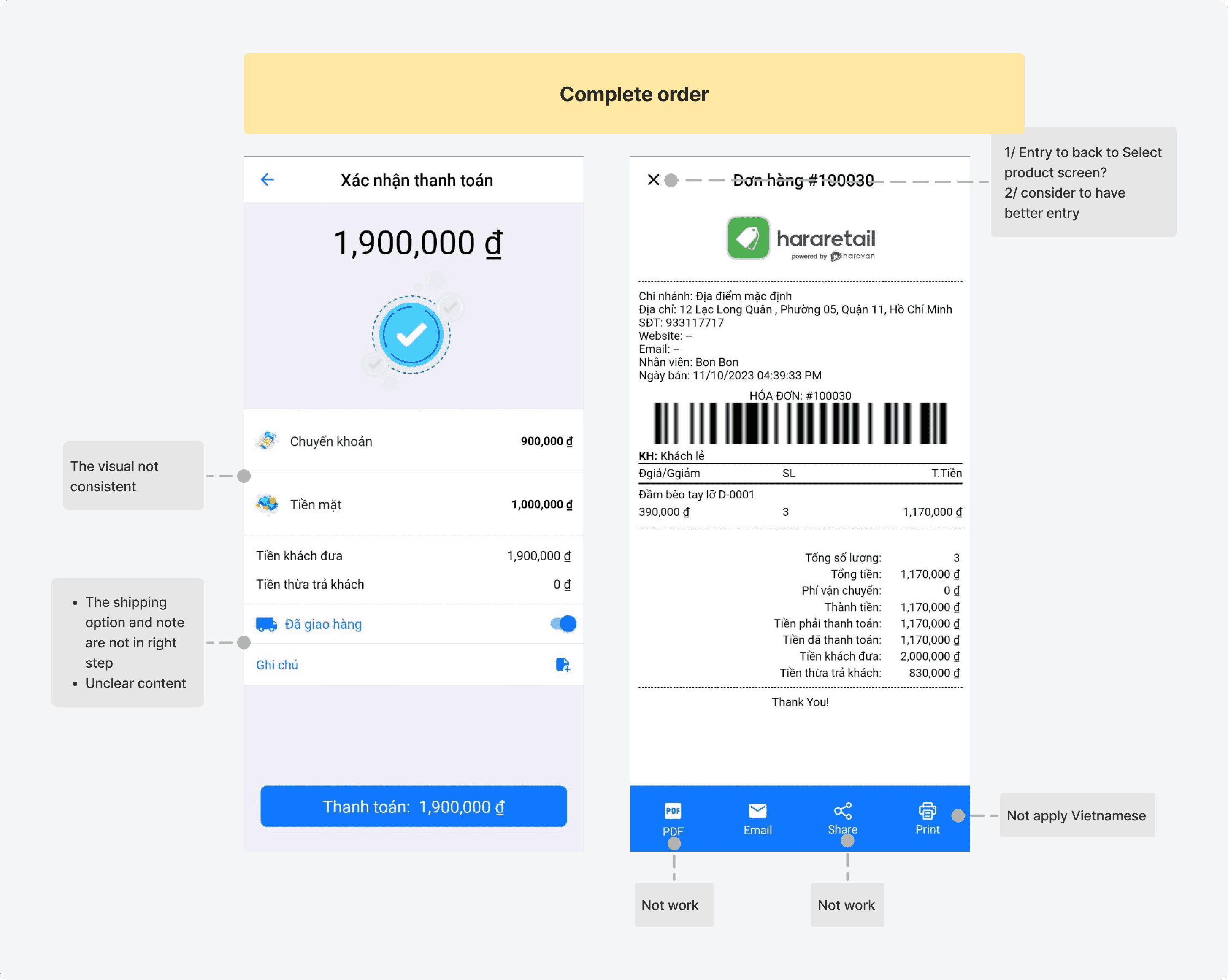
Payment & Complete
• Product Consultation: The seller directly interacts with customers, and provides advice on products to help customers choose suitable items.
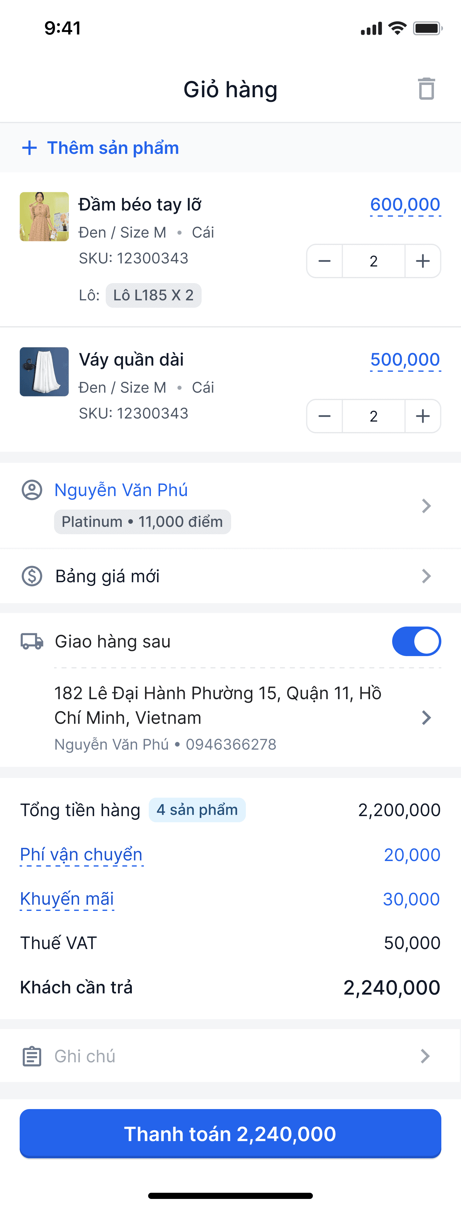
• Order Creation: After the customer selects a product, the staff enters the order information, including quantity, customer details, applicable promotions, and summaries the total cost.
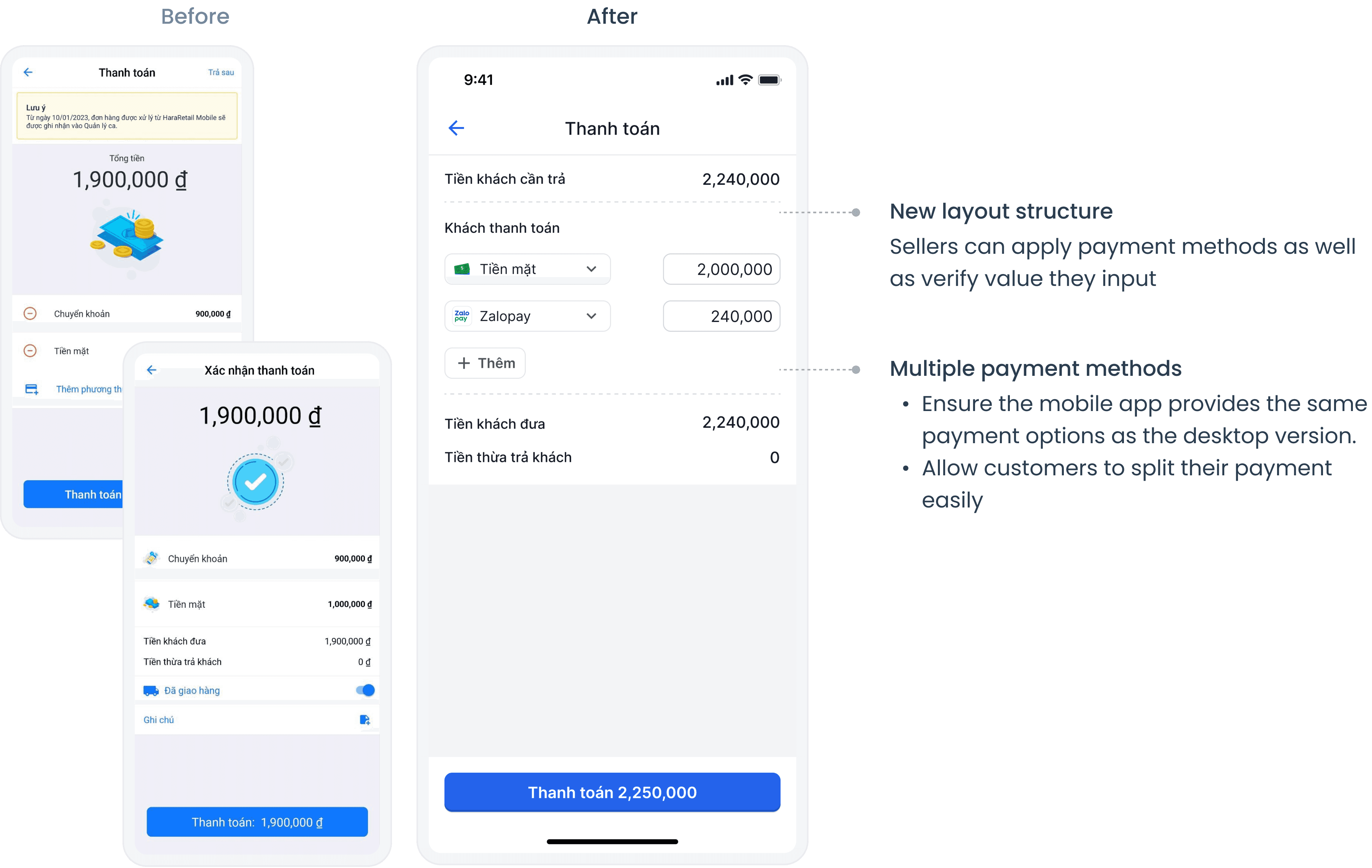
• Payment & Completion: The sellers selects the payment method according to the customer’s preference and completes the order.
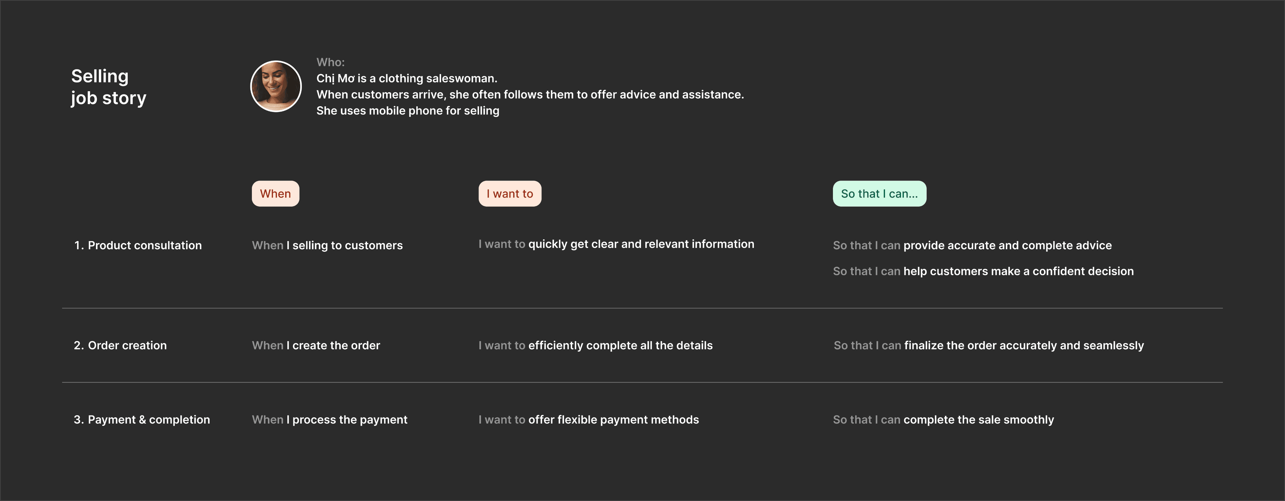
Job story
From those and feedbacks gathered, I created the Job stories for sellers to outline their work needs.
Evaluating the current design
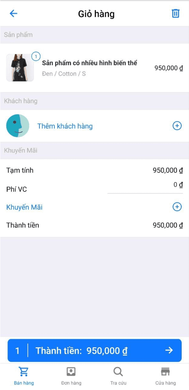
There were several points :
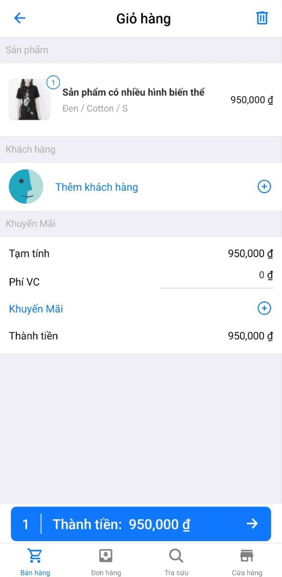
• Poor user interface: The outdated design and poorly crafted content give it an antiquated and superficial feel.
• Inconsistent functionality: Features have not been updated in a long time, causing differences with the desktop version. Some features are present but don’t function as expected.
• Misaligned experience: Certain aspects of the user journey did not align with the appropriate phases of the sales process, causing friction and reducing effectiveness.
Objective
I set some goals not only to address the ove problems but also to meet sellers’ needs throughout their selling process as mentioned in the job story
Enhance User Interface
Redesign by applying design principles and ensuring consistency with the established design system
Ensure Feature Consistency
Update and synchronize features across the desktop and mobile versions to provide a unified user experience.
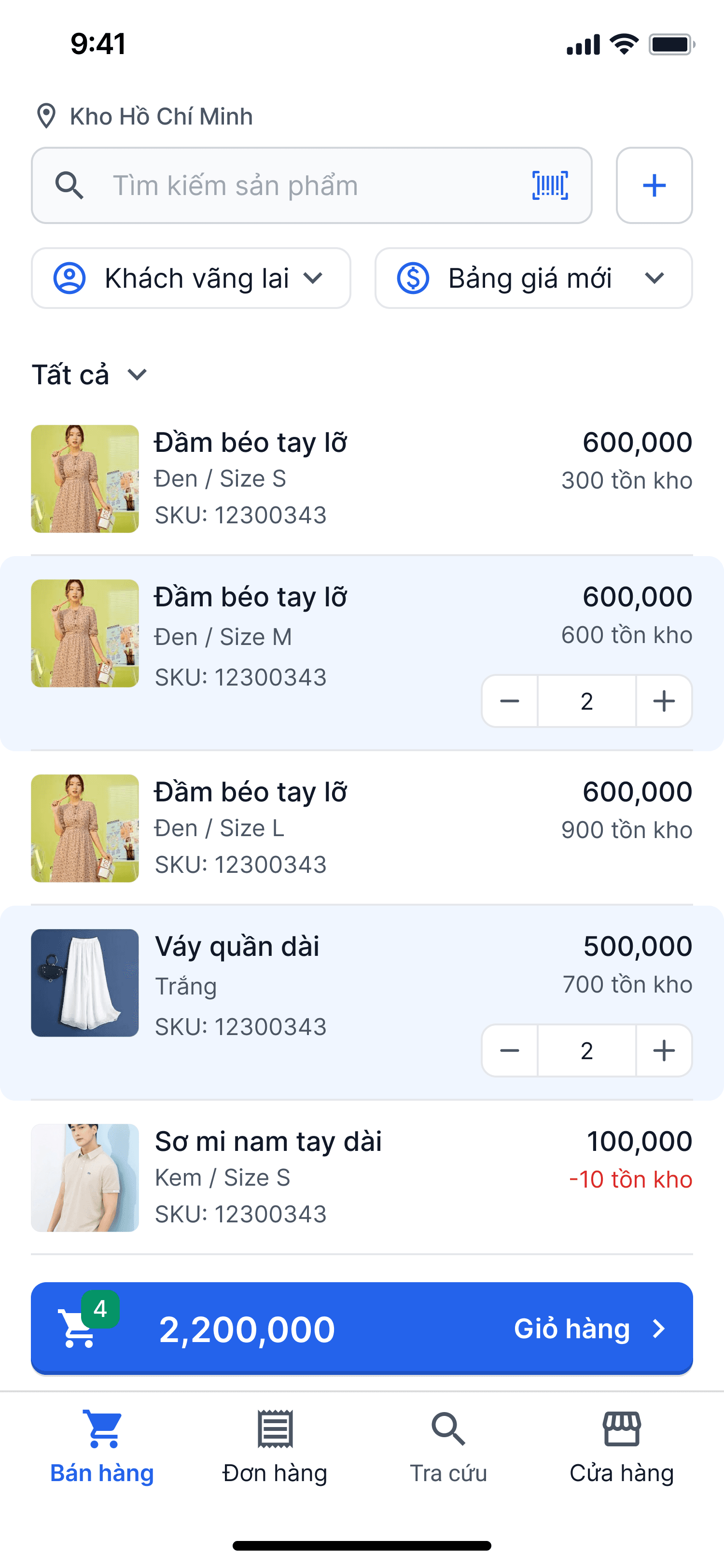
Optimize Sales Experience
Align the user experience with the appropriate phases of the sales process to ensure a seamless and effective flow

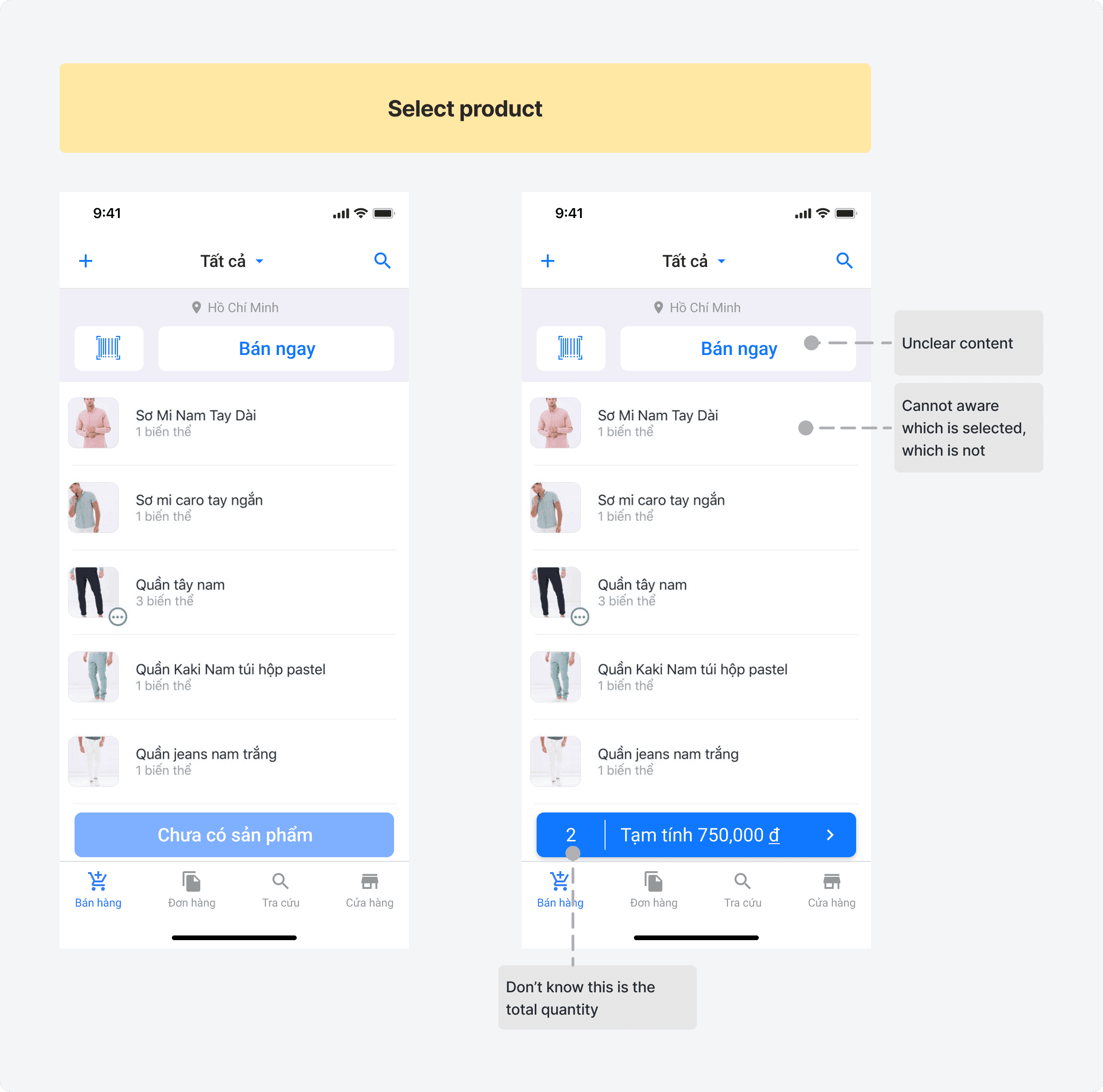
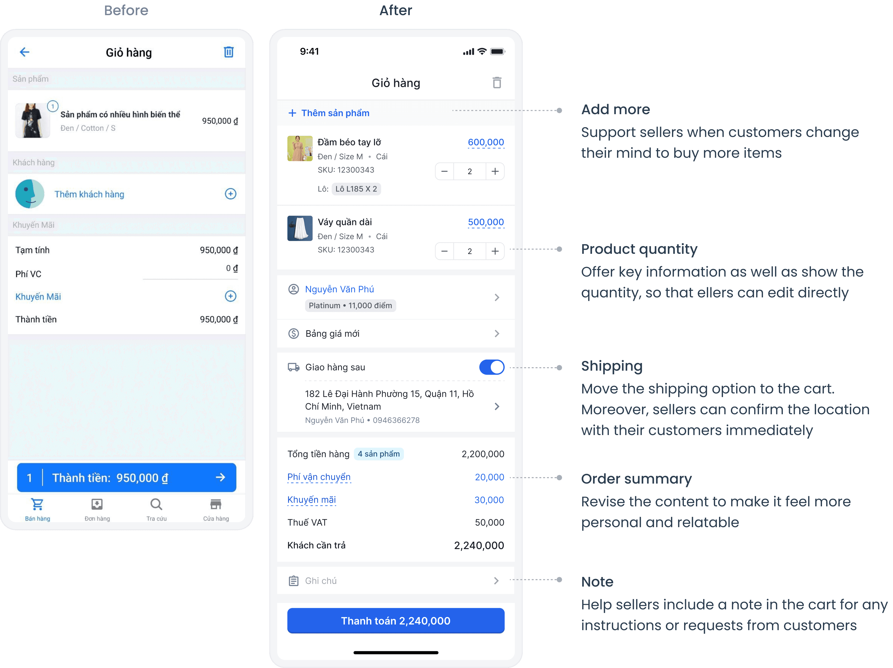
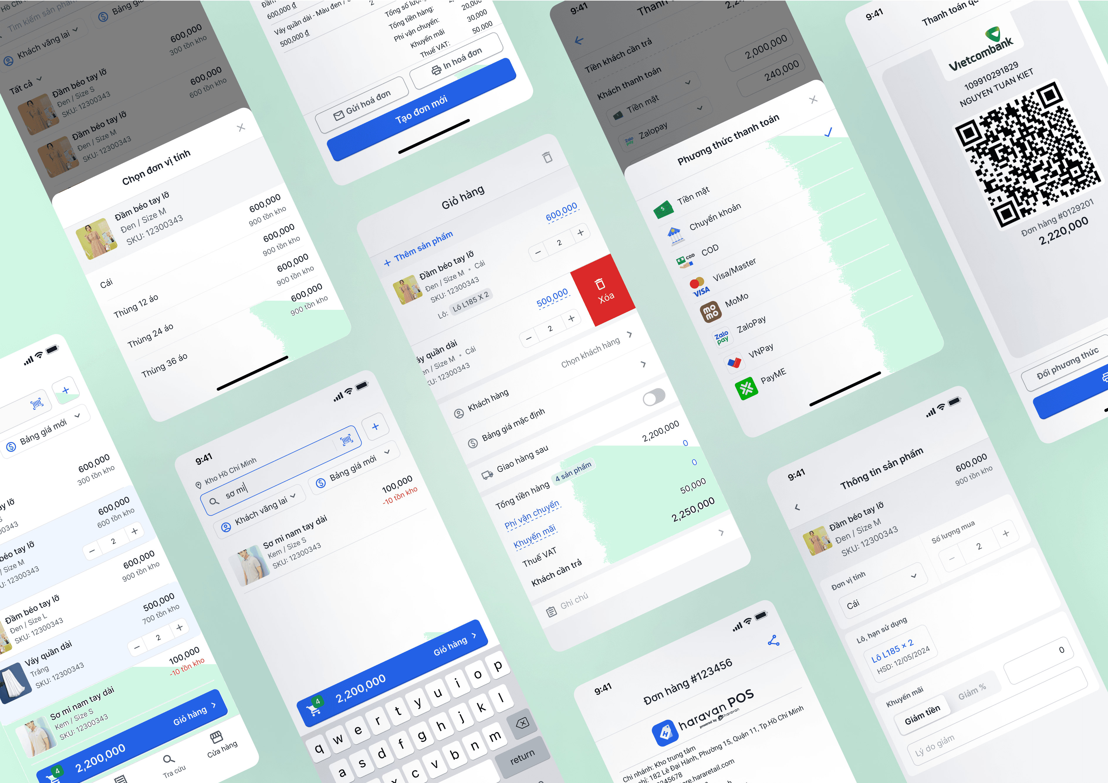
Let’s brainstorm some improvement
Product Consultation
Order Creation
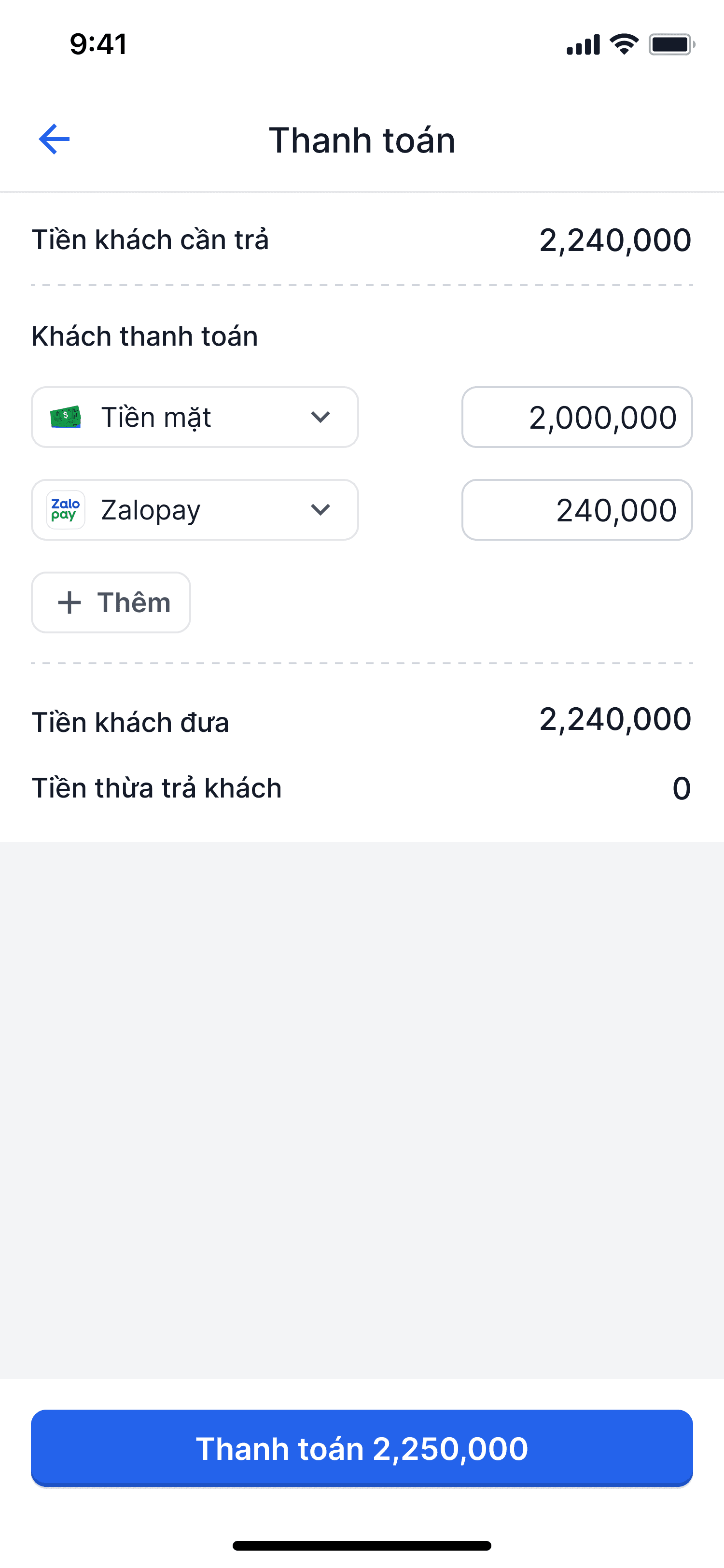
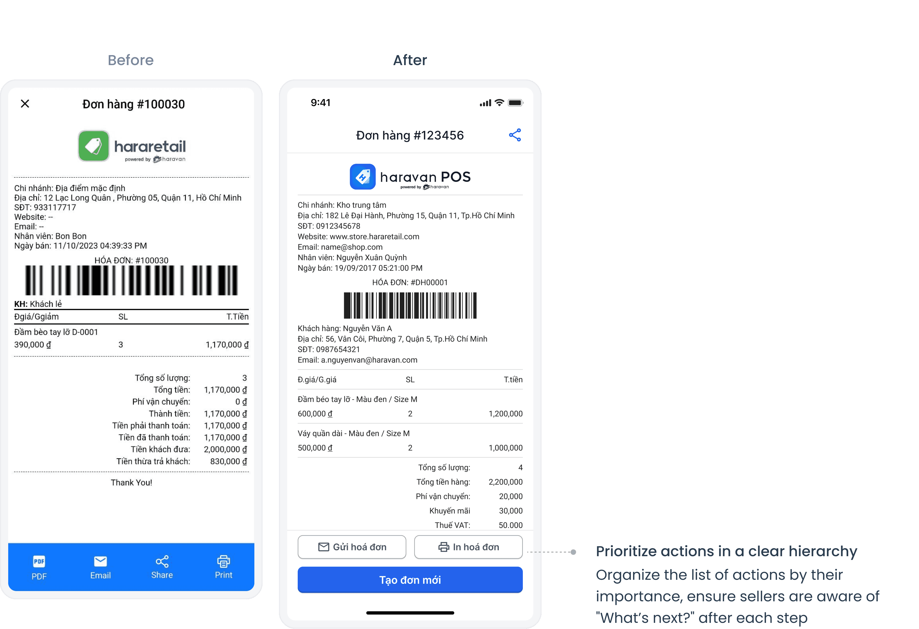
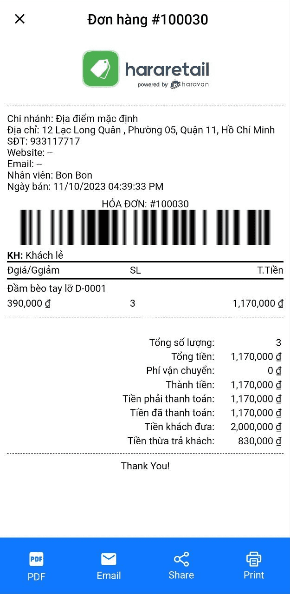
Payment & Complete
📚 Lessons learned
• Gain empathy by joining the process
By observing the merchants' sales staff in real-life settings and reflecting on my personal shopping experiences, I was able to map out the selling process and better understand their needs at each stage. This direct involvement gave me valuable insights into their pain points and helped me design solutions that cater to their specific requirements.
• Ensure the consistent experience across devices and platforms
Failing to update the latest features across all platforms created an imbalance and inconsistency when sellers switched between web and mobile applications of the same product. I learned the importance of maintaining a unified and seamless user experience across different devices to prevent confusion and enhance user satisfaction.
Thanks for your view !
