From a pattern to mobile experience improvement

From a pattern to mobile experience improvement

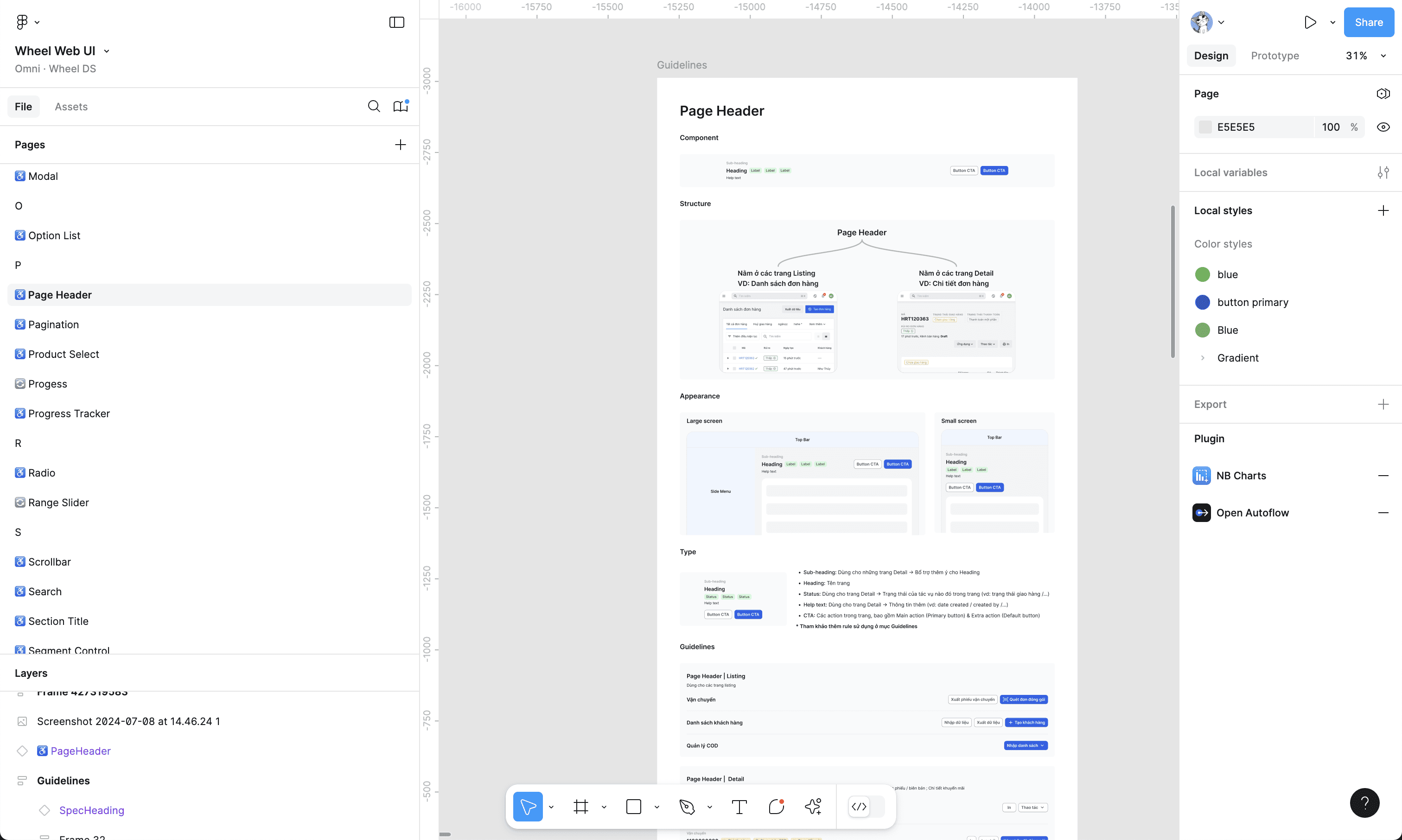
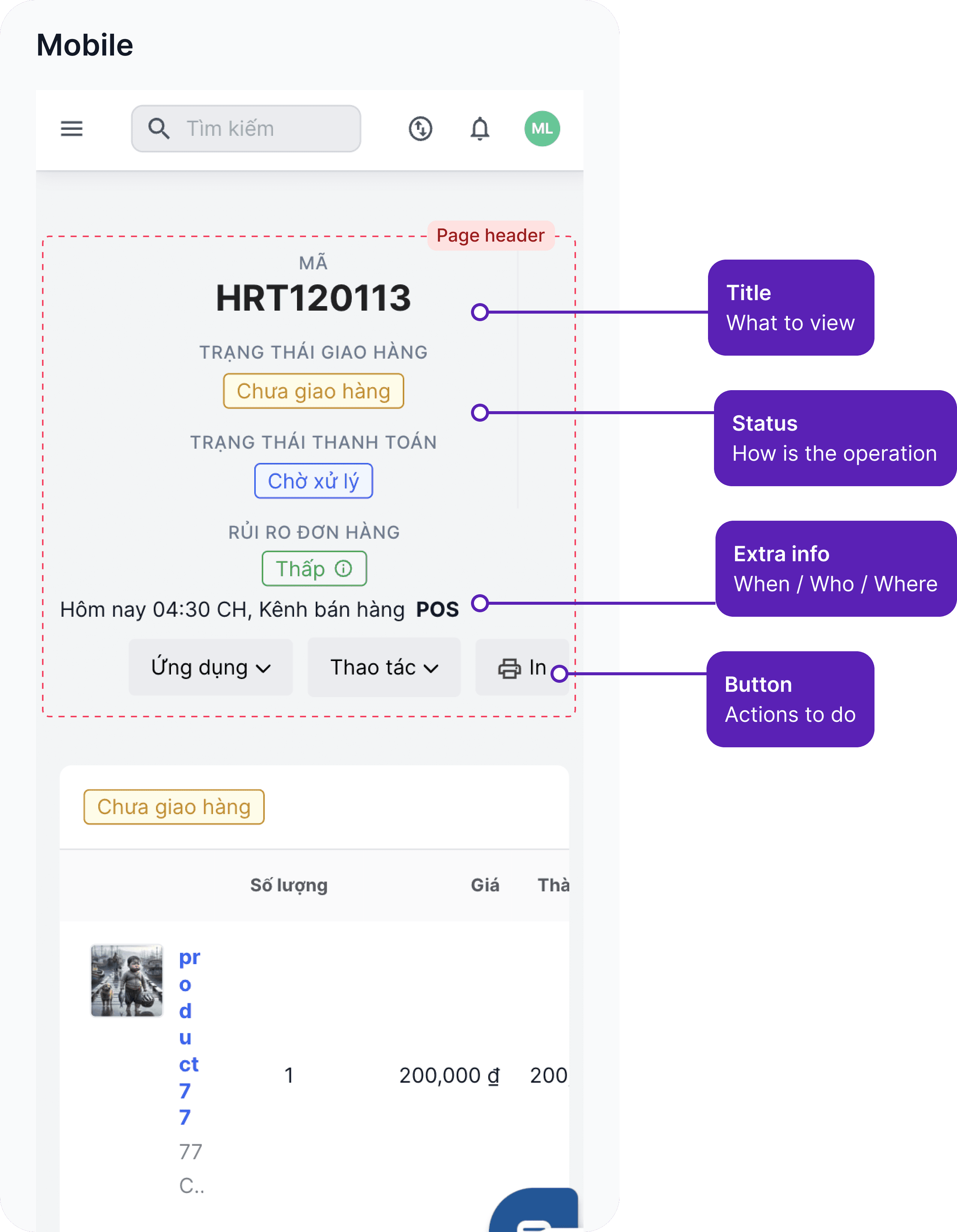
On each page of the platform, we have a pattern in the form of a page header.

It helps merchants identify the page, monitor the operation or take related actions.

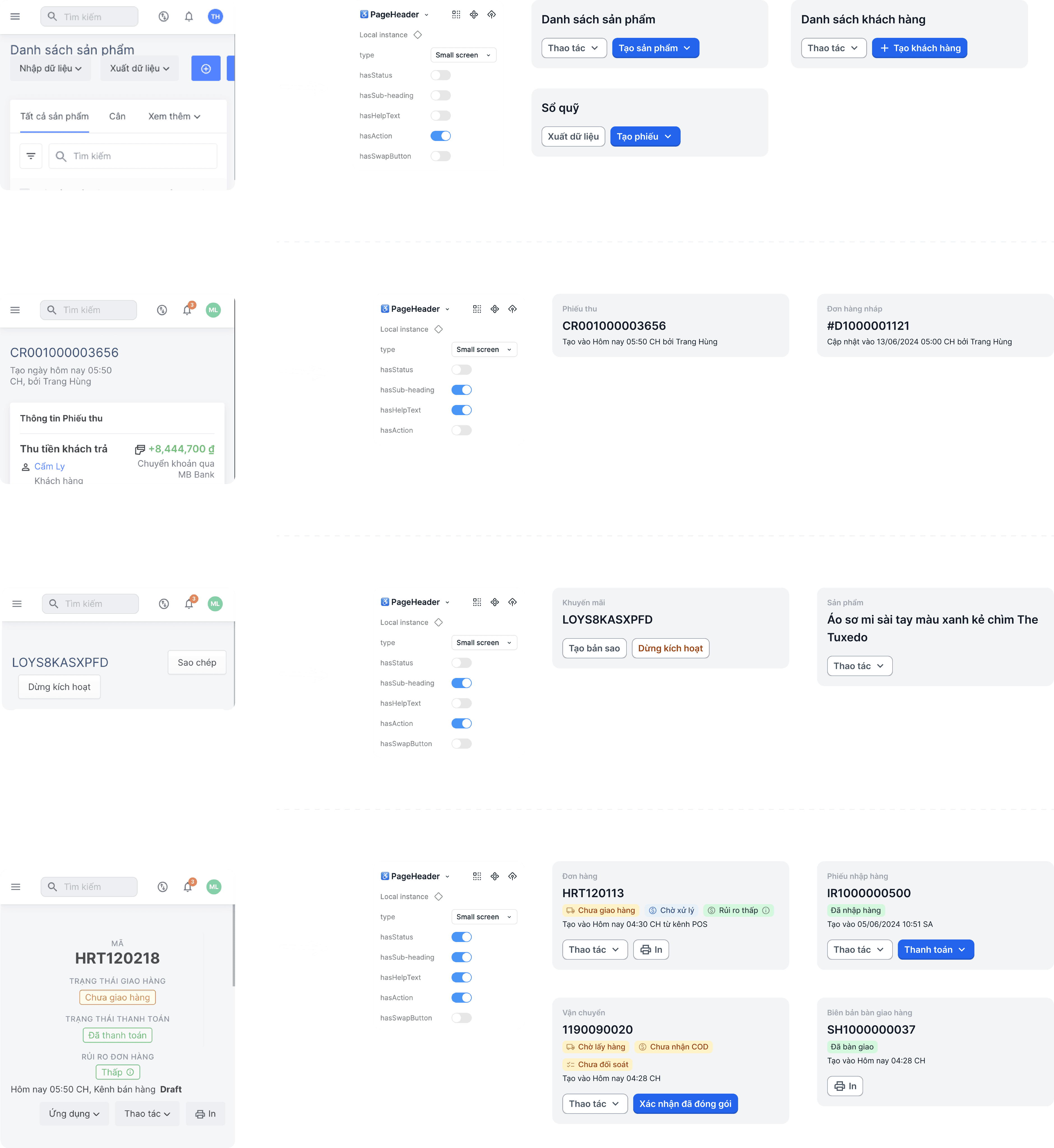
The image shows the basic format of the page header 👉

The image shows the basic format of the page header 👇

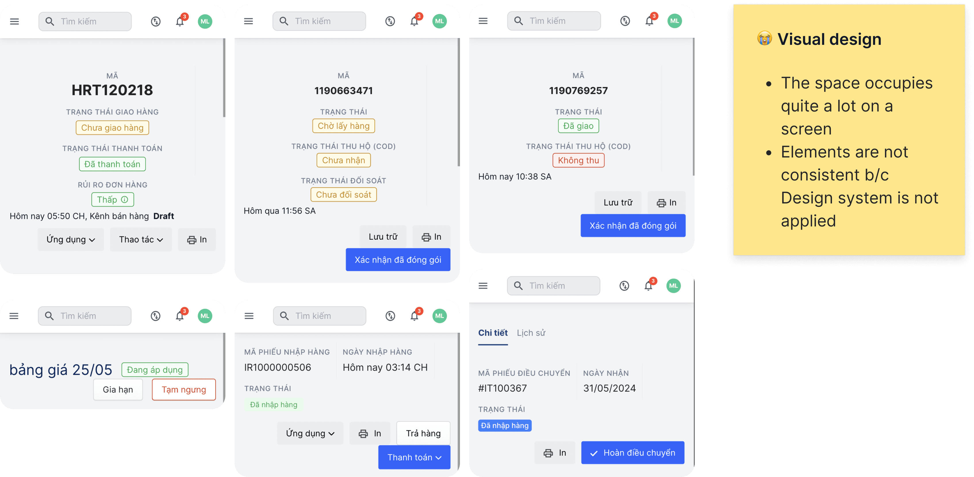
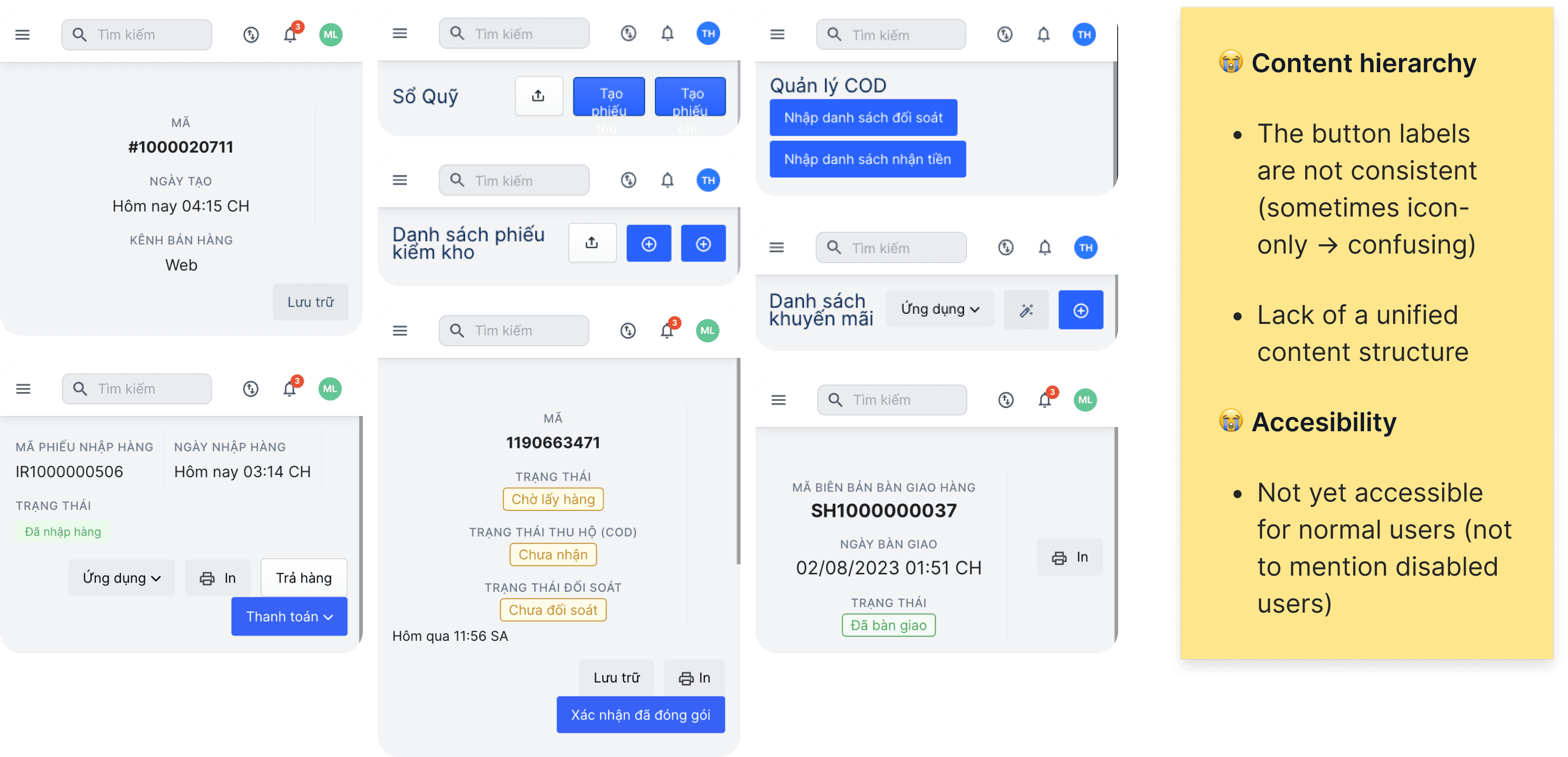
I found it has so many variants with some weaknesses

Crafting component

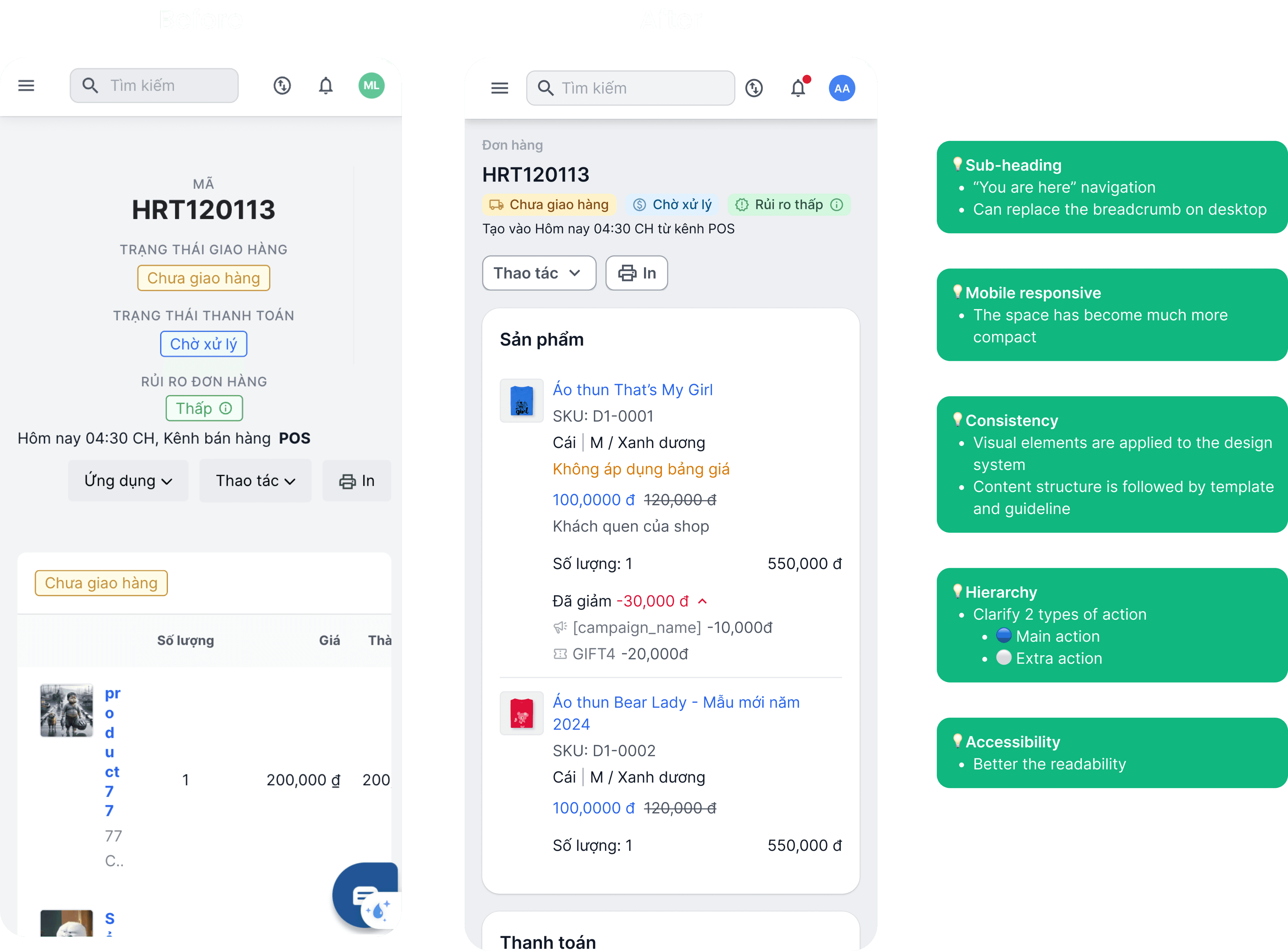
Evaluating

Verifying use cases

Drafting guidelines
For the responsive design limitation, the images may not appear as clear on mobile devices.

For the best viewing experience, you're welcome to visit the site in desktop mode.

If that’s not a big deal to you, let’s get started!

I'm sorry…