I’ve learned how to better manage design files on Figma
For the place where I work, design files are the main source of between designers and product owners (PO) about solutions for products in a project. And not only these two characters but later on, this will be a place for everyone involved to use, according to their role. However, as the person directly working, I feel “something is wrong” with the team’s current way of managing design files.
Where is the feeling of “something is wrong”
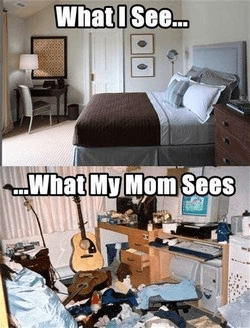
On a normal day, I open Figma. But stop! Wait a minute!!… Why does this feel so familiar? Surely, everyone has seen this meme photo at least once. That’s right, the feeling of clutter arises and I need a ‘major cleaning’ 🤣🤣
To be honest, at that time a simple thought flashed through my mind: “Is there available template on Figma Community to use 🤔🤔 ??”
Okela, everything is resolved. I go to Figma Community, search keyword, there are up to 100 templates available for you to use. The story ends…
No. I couldn’t find my want (how could it be easy 😅😅)
Referencing sources are various, and only valuable when you already know what you want and choose the appropriate option. Indeed, templates help solve common problems that most people encounter and support them to apply quickly.
Get back to the problem
I approach with the question: “Who really cares about the design files?”
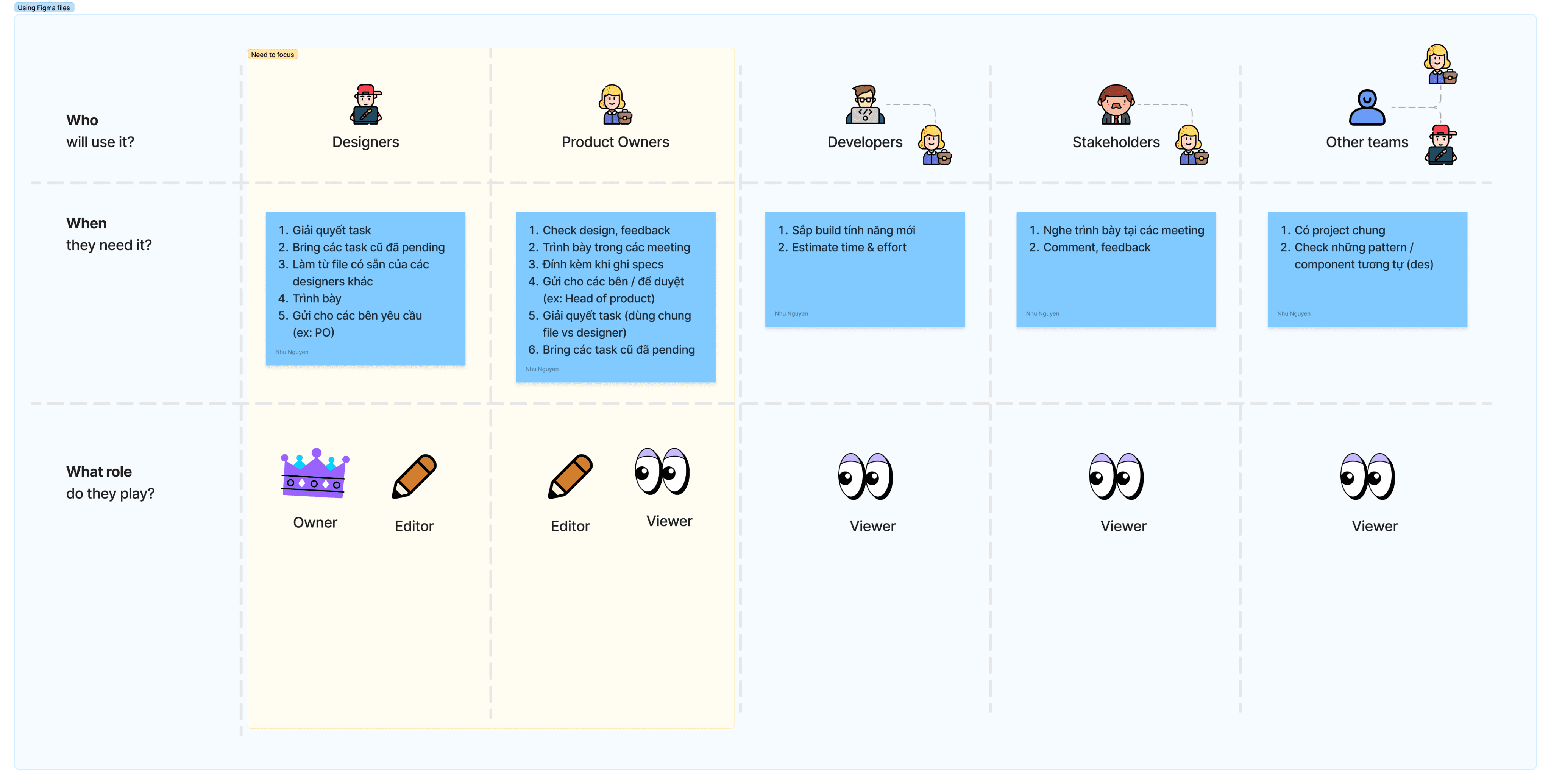
There’s no certain number of participants in a design file, I would specifically define 3 types of users as follows:
👑 Owner: The person creates and manages the file. In this situation, it would be Designer, abosultely.
✏️ Editor: The person is responsible for editing. It would still be Designer, just some cases, PO would be join to change minor contents.
👀 Viewer: As you know, the view-only mode. It would be the stakeholders or someone viewing related section to do their works.
It can be seen that Designer and PO are the primary users
• They are characters work on the design files the most
• They also become the bridge so that other people (Devs, Stakeholders,…) can get the files
So I will focus on these two users to analyze their activities when working on files.
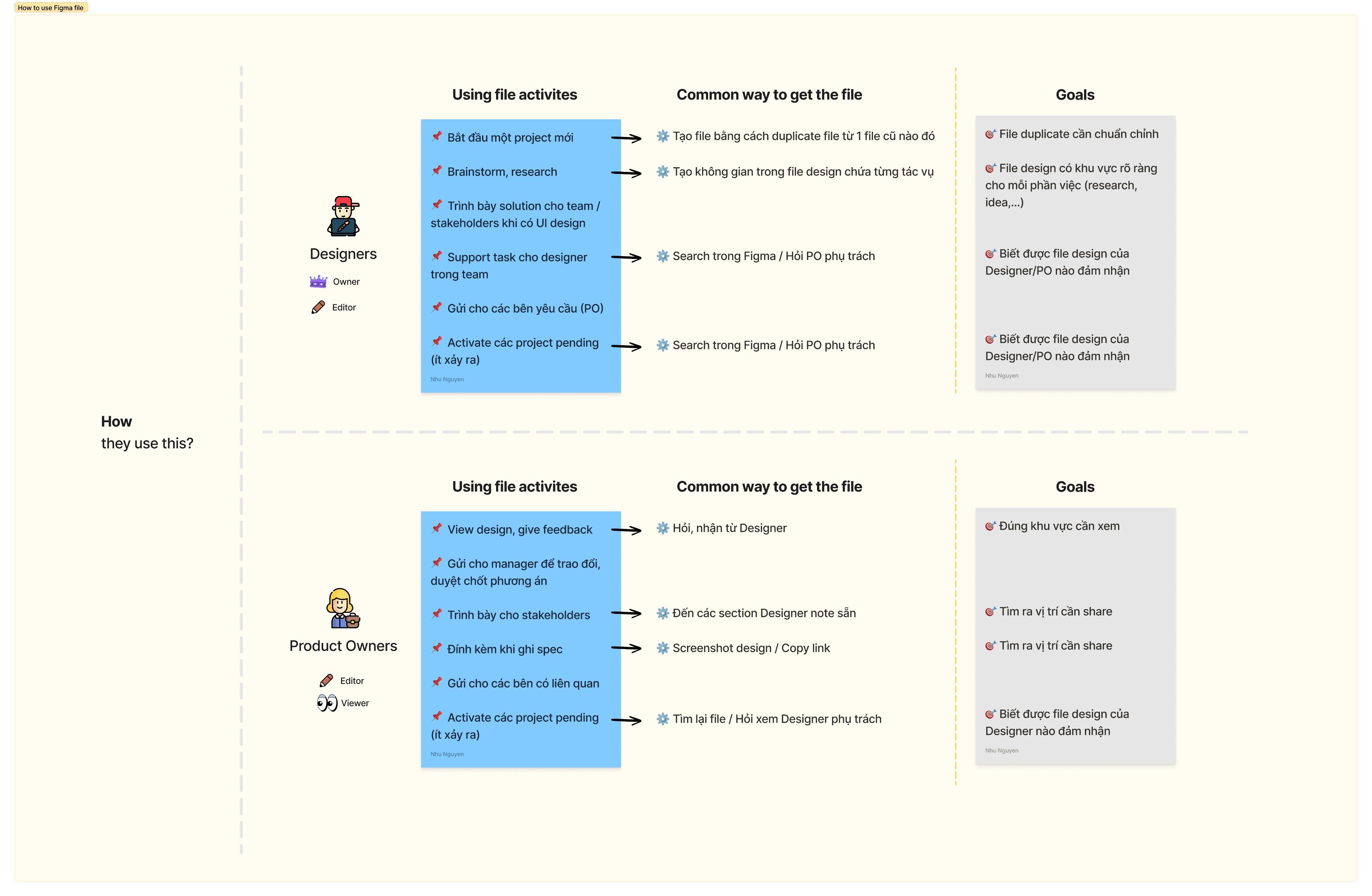
Designer and PO activities on the files
By engaging in a conversation with POs and observing the reality within my design team, I gathered a task list that designers and POs engage in while working with design files, and how they go about it.
I found that
• Design files are created freely according to each designer’s style, so the file is “too various”.
• With the growing number of projects, it becomes challenging to keep the folder management organized and recognizable.
• The people in charge is important so that people can get the right person and ask about the task.
• People care about minor sections in the whole design when they want to focus on the specific case.
So I set goals for creating the design file that
• It needs the format and structure
• It needs to show the people in charge when scanning the file
• It needs to highlight sections so that people view what they want, share what they want
This time, I feel confident that I will follow the creating the template to meet the above factors
When I have a design file template, I want to have information including format, structure, guideline, so that my team work consistently and manage file easily.
Okela, we have the first elements, but where are they? Let’s continue to look to see what’s in a design file!!
What does the design file include?
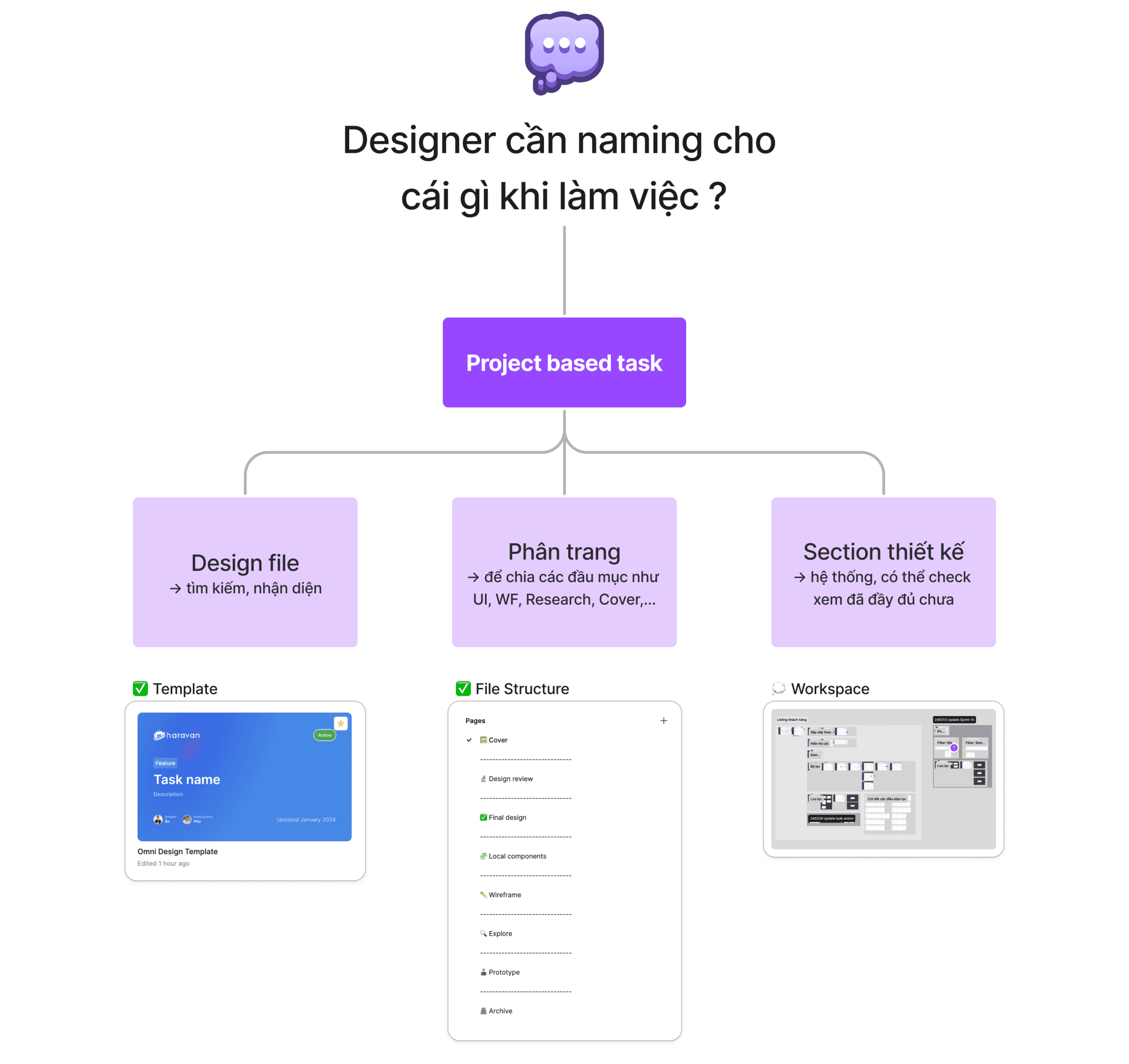
A file has to be clear enough for viewers to understand two things: its outside and inside
• Outside: How to know the file
I focus on, while just browsing, how can people know that this is the file they’re looking for? Perhaps a cover (file avatar) will help.
• Inside: How to view the file
I focus on how designers arrange pages based on their function. To achieve this, improving file structure is my aim.
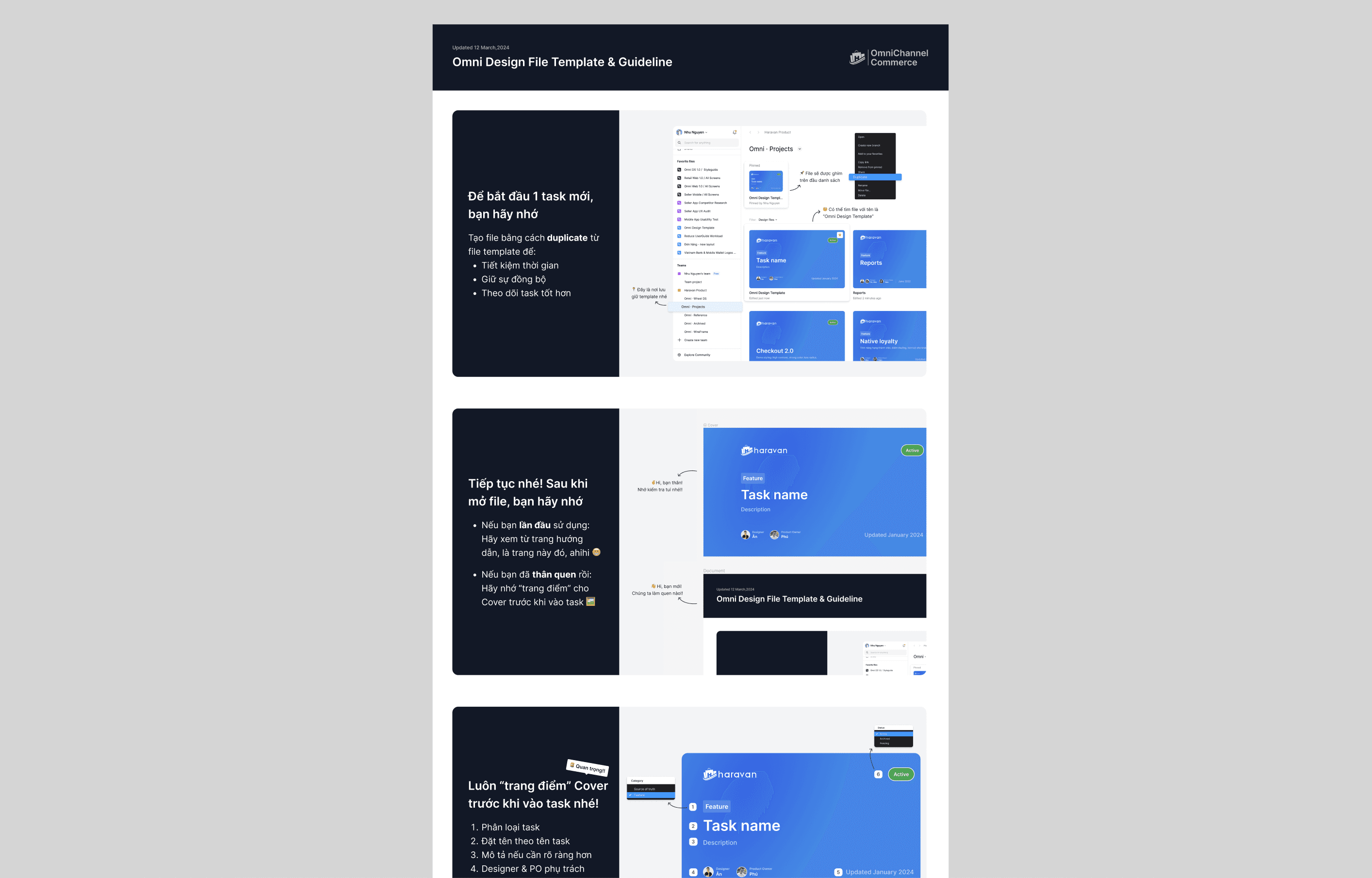
Cover
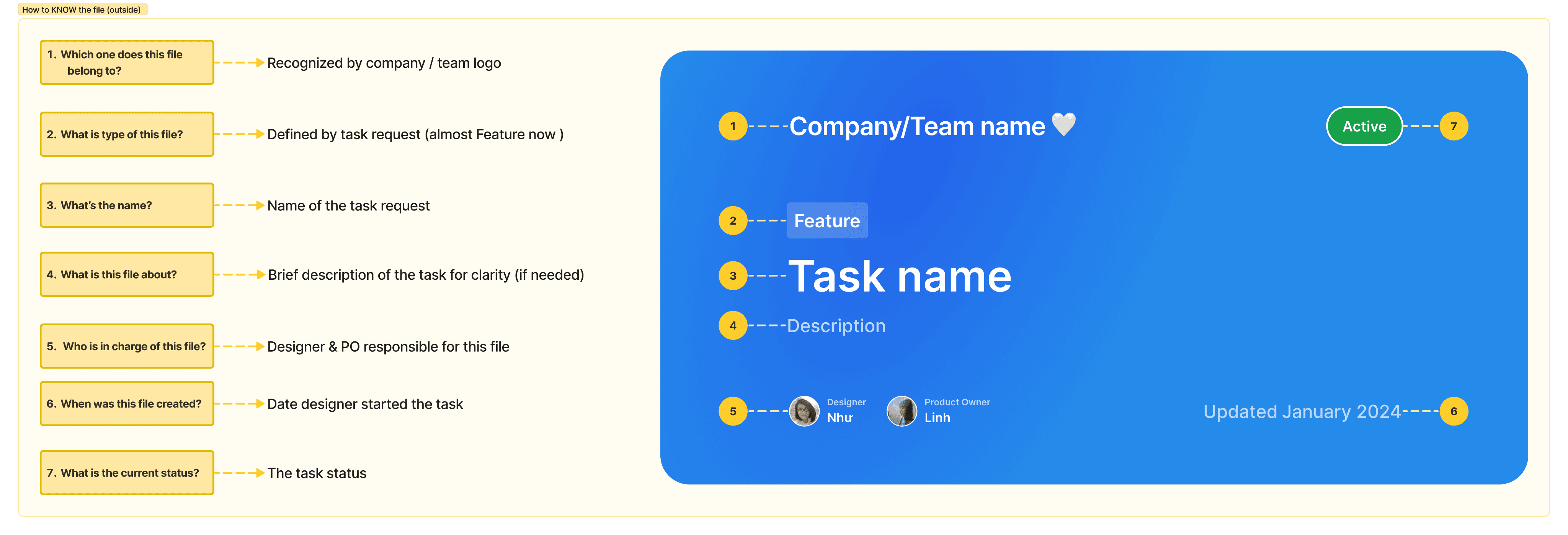
I've developed the Cover variant to address the query 'What allows individuals to identify the file?', encompassing:
• Company/Team name: Use the company logo or the team name to represent if the company has multiple product teams
• File type: Based on the task request (currently my team only uses “Feature” for tasks)
• Task name: Follow the feature name, or use a keyword that is understandable for the entire team
• Description (Optional): Provide additional details about the task to ensure clarity for the viewer, especially if the task name is not sufficient
• People in charge: Tag the Designer and Product Owner who are responsible
• Date: Note the task start time
• Status: Indicate the current status of the task (Active/Pending/Archived)
Template
It will be included in the template file with the guideline attached. I think this will help new team members get accustomed to our working style.
File structure
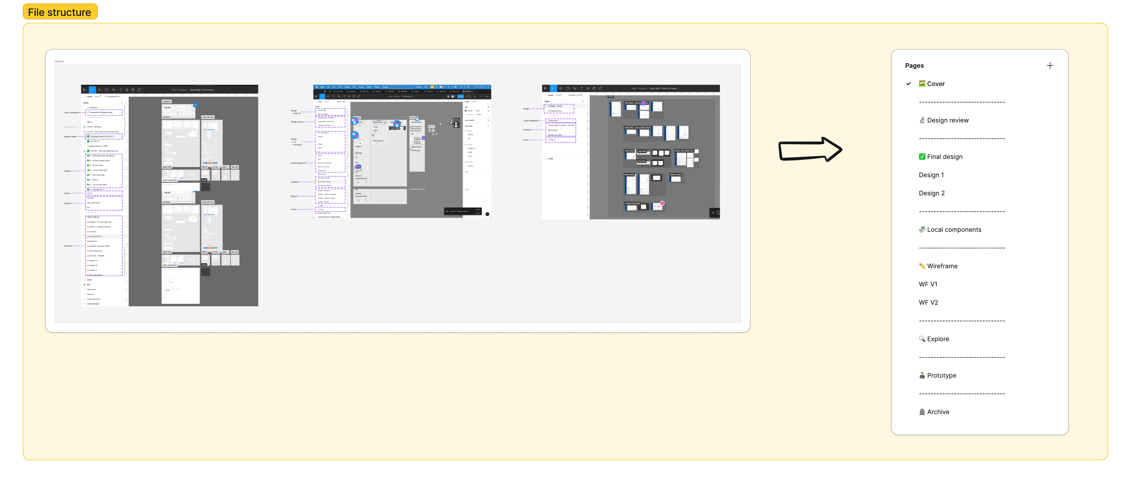
As I mentioned, designers are free to create not only working files but also various category pages, depending on their needs. Upon closer inspection, regardless of the number of categories used by different designers, they all share common pages (e.g., UI, Wireframe, Component, …). Based on this observation, I have organized them into a general structure:
🖼️ Cover: I mentioned it above
🔬 Design review: The designer can test the UAT version. This is where they can take notes and send them to the Dev to review and fix.
✅ Final design: This is the place to display the complete UI of the solution, along with all cases and flows. Therefore, the sections on this page need to be named and explained clearly( I will explain later). This category can have more than one page depending on the size of the task.
🧩 Local components: We still prioritize using components from the design system, but in reality, there are cases where we also create our own components and use for specific task, so we need an area to store them.
✏️ Wireframe: Most of my team, including the PO, select to wireframing on other tools like Visily, Whimsical, etc. On the file, I select to attach a link, so that everything can come from a single source.
🔍 Explore: This is the playground for designers. Here, they can research and brainstorm all about tasks, freely mess around and express their ideas.
🕹️ Prototype: When there is a request for a mockup or prototype to showcase features, the designer can make it separately.
🪦 Archive: This is place containing old design versions or where designers need to clean up unnecessary items on other pages to avoid confusion.
Of course, not every task has to be full of pages, such as Local components or Prototype. Our team agrees that we can skip pages if they are not needed for the task.
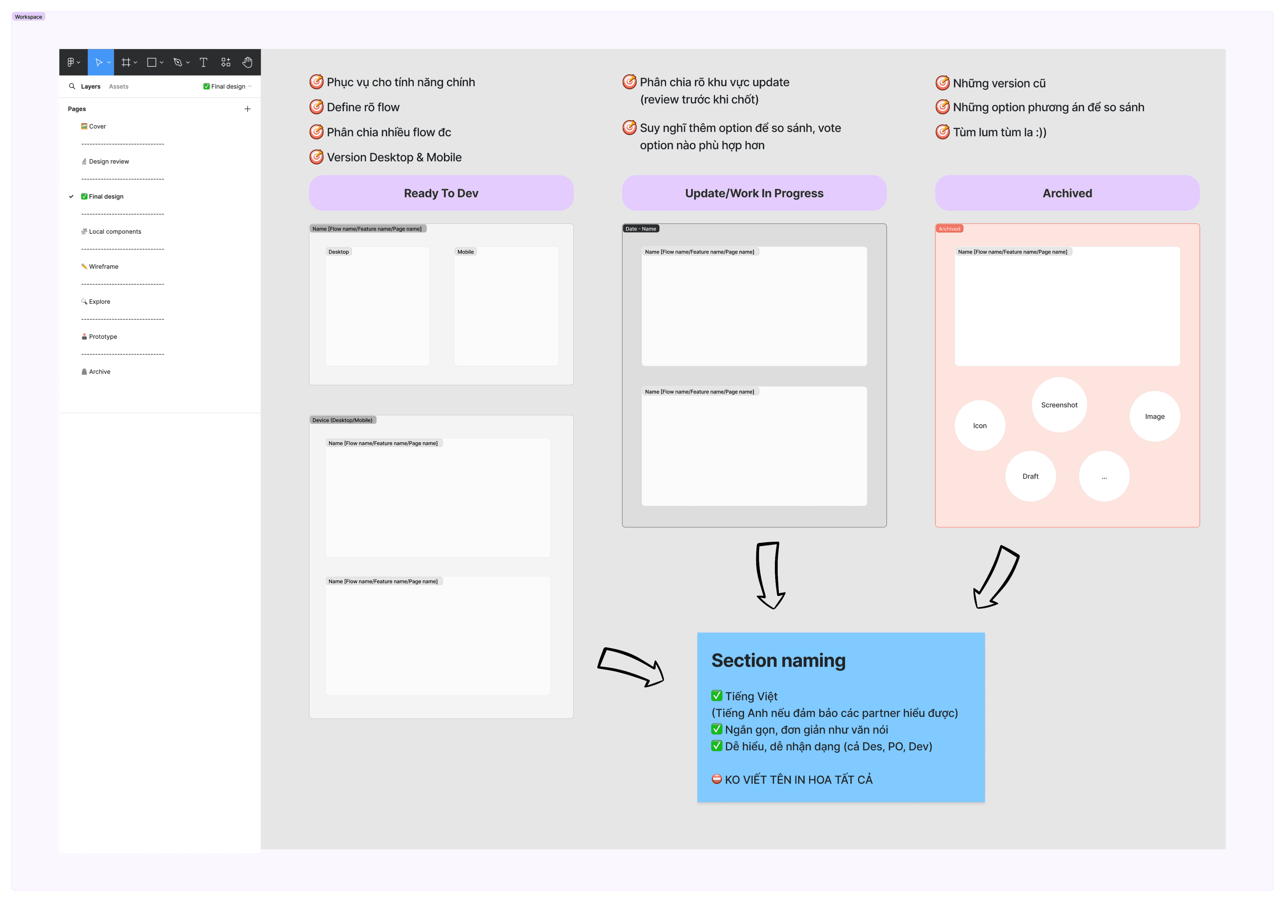
Section
Designing is iterative, so having many updated versions is inevitable. So section management and naming is necessary for any viewers
Finally, we've applied on our work
Now our files have something more beautiful, better management


